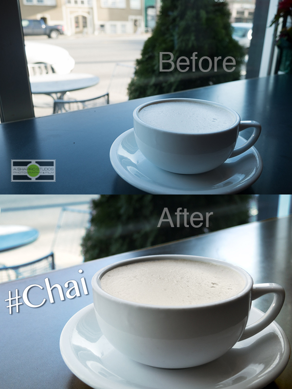
Inspiration can strike anywhere, anytime.

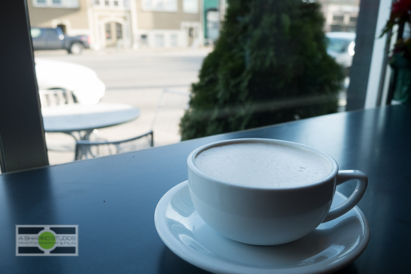
I had just received a new camera (a Panasonic DMC-GX7, which I’ll blog about soon) and was on my way to a business meeting at Macrina on 1st Ave in Seattle’s SoDo neighborhood. Wanting to test the camera, on my way I saw some fog being lit up by a street light and the idea was cast – steam rising off a cup of coffee. One of the things I was looking for in the image was texture of something fine, like foam – so I went with a Chai Tea Latte. I wanted to be inside, looking out, with the street visible in the background of the photo. Only problem – it was afternoon and the windows of the coffee shop face east, so no light streaming in – no steam today. That’s OK – Let’s make a photo anyway! The shot straight out of camera was dropped into Adobe Lightroom, my application of choice for RAW adjustments, Metadata and Keyword Management. I think it does a good job of giving me a neutral base to start from, which includes a lens correction on import (to fix any barrel distortion, etc). Here’s the shot as it came in.
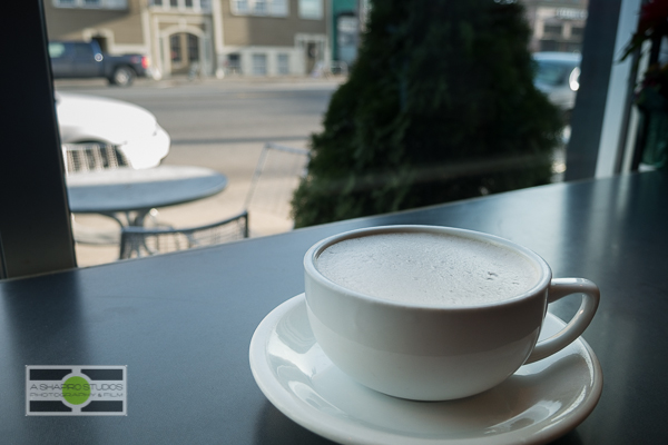
OK – some small adjustments are needed. I don’t think the crumbs do anything for the shot and Lightroom’s new spot healing brush is great. Let’s put that to work, along with some color temp fixes, straightening, some exposure adjustments… Nothing too specific; broad strokes. OK good – let’s go to Photoshop. Here’s the image that went out of Lightroom for the roundtrip.
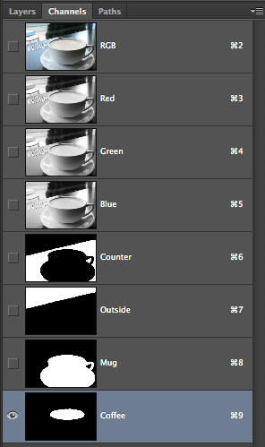
Good Photoshop is Good Selections, so let’s start by defining some areas I was planning to play with.
Next was tightening everything up. The cars were a distraction and color wasn’t quite there yet. Let’s crop and straighten – and we get here.
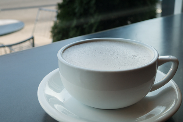
We still have the street and the outdoor seating, the mug is nice and straight and takes up more of the frame (one of my 3 golden rules to photography), and now we’re ready for localized adjustments. The counter surface looked a little dead to me, the mug was a bit green and the foam… well, when I think of chai I think of a very orange-brown liquid and the crisp white foam wasn’t working for me. Curves, Hue/Saturation and a color fill will fix those.
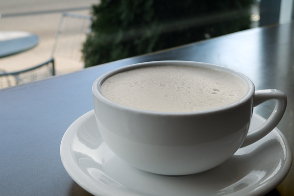
Next was the outside which was too warm – it was competing with the mug – brightness/contrast and another color fill will do the trick!
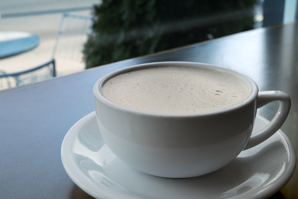
Now time to make the mug really pop. A brightness/contrast, curves and levels adjustment later and we’re almost done.
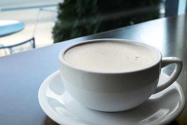
To give it that commercial feel, I wanted to drop on some sample text. I played with a lot of ideas (including making the words look as tho they had been sprinkled on to the foam in cinnamon) but it wasn’t really working for me.

In the end, it was Bangla that won for font with a small stroke and drop shadow for the final image. Have an idea, make adjustments as needed and follow-through for a successful image. Now go out and make great photos!
